|
| Figure from [link]. |
To get an idea of what things look like to birds, we have to incorporate that UV information we can't see. Taking photographs of the UV world can take some special equipment, but even consumer grade cameras can be altered to better capture UV light. I've been interested in photography for a while and I've been interested in UV photography, but I haven't yet invested in the equipment I'd need to take UV photos. For now I have to rely on people posting occasional UV photos to get an idea what things look like. (For a good selection of photos in UV and other frequency bands, go take a look at: photographyoftheinvisibleworld.blogspot.com)
You can look at UV light photos next to visual light photos to get an idea of what things look like to birds, but I decided to see if I could do one step better. I wrote a script which takes four image channels (Red, Green, Blue, Ultraviolet) and compresses them into the three we can see (RGB). The math for this is pretty simple and so doesn't match what really happens in detail, but it might help us get an idea of what things look like to birds.
\(R_h = R_b + \frac{G_b}{3}\)
\(G_h = \frac{2(G_b+B_b)}{3}\)
\(B_h = \frac{B_b}{3} + U_b\)
In UV this flower of the Marsh Marigold (Caltha palustris) is dramatically marked, but in our composite RGBU image it really doesn't stand out that much. Flowers rarely utilize birds for their pollination, so it shouldn't be any surprise that they might not look too dramatic to birds. (Bees can't see red, but can see UV, so they'd have no problem seeing the marks on this flower.)
Can we find some nice UV imagery of something that birds would care about? Well, it's a bit harder to make paired visual and UV photos of a creature which is suspicious of your intentions. Recently, I came across a post by twitter user @JamieDunning illustrating some dramatic fluorescence on the beak of a Puffin specimen he was examining. It occurred to me that something strongly fluorescent should also be UV-dark, since the UV energy is being absorbed and released at visual frequencies instead of reflected. I realized from this I could construct a simulated UV-channel by inverting the fluorescence image (and mapping the images together to correct for the different camera position (and using a bit of artistry to clean up the fluorescence image)). Performing the same image channel compression as I did earlier, we get the lower-right portion of the next figure.
It would be nice to have a comparable real UV-photo for doing this comparison, but that the simulated bird-vision of the Puffin's beak shows a much greater color contrast than we saw with the Marsh Marigold (and that both results align with the evolutionarily expected results) suggests this might be a useful approach.
My wish-list, money-is-no-option, sort of data for doing this kind of image analysis would be that produced from hyper-spectral imaging. A hyper-spectral camera takes images at a large range of narrow frequency bands. We could map that data (vs. the color sensitivity spectra illustrated in the figure at the top of this post) to what either birds or humans can see, as well as something like the transformation I've described here to illustrate in human vision what a bird could see.
I'm not sure anyone would provide sufficient funding for me to explore this, however.
@JamieDunning recently submitted a paper comparing the original photo with spectrophotometer examination of regions of the bill. I'm looking forward to their paper to see how the results compare to the predictions from my playing around with the math.
References:
 |
| RGBU (bird vision) -> RGB (human vision). |
This math is represented visually in the diagram at right. At the top are the four image channels that birds can see and at bottom are the three we can see. All the information that birds can see in their red channel goes into our red channel, along with a third of what birds see in their green channel. The other channels of a bird's vision are similarly apportioned into the channels we can see by moving from top to bottom in the figure.
Conceptually, this is similar to drawing a 3D cube on a 2D sheet of paper. Some information is lost in the transformation, but much of it comes through the process and allows us to visualize something that otherwise can't be done (in 2D). In this case, we're transforming a 4D data structure into a 3D one, that just happens to be presentable as a color photo.
To show what this math means for a photo, I found a nice example paired set of visual and UV images from photographyoftheinvisiblew... to work with.
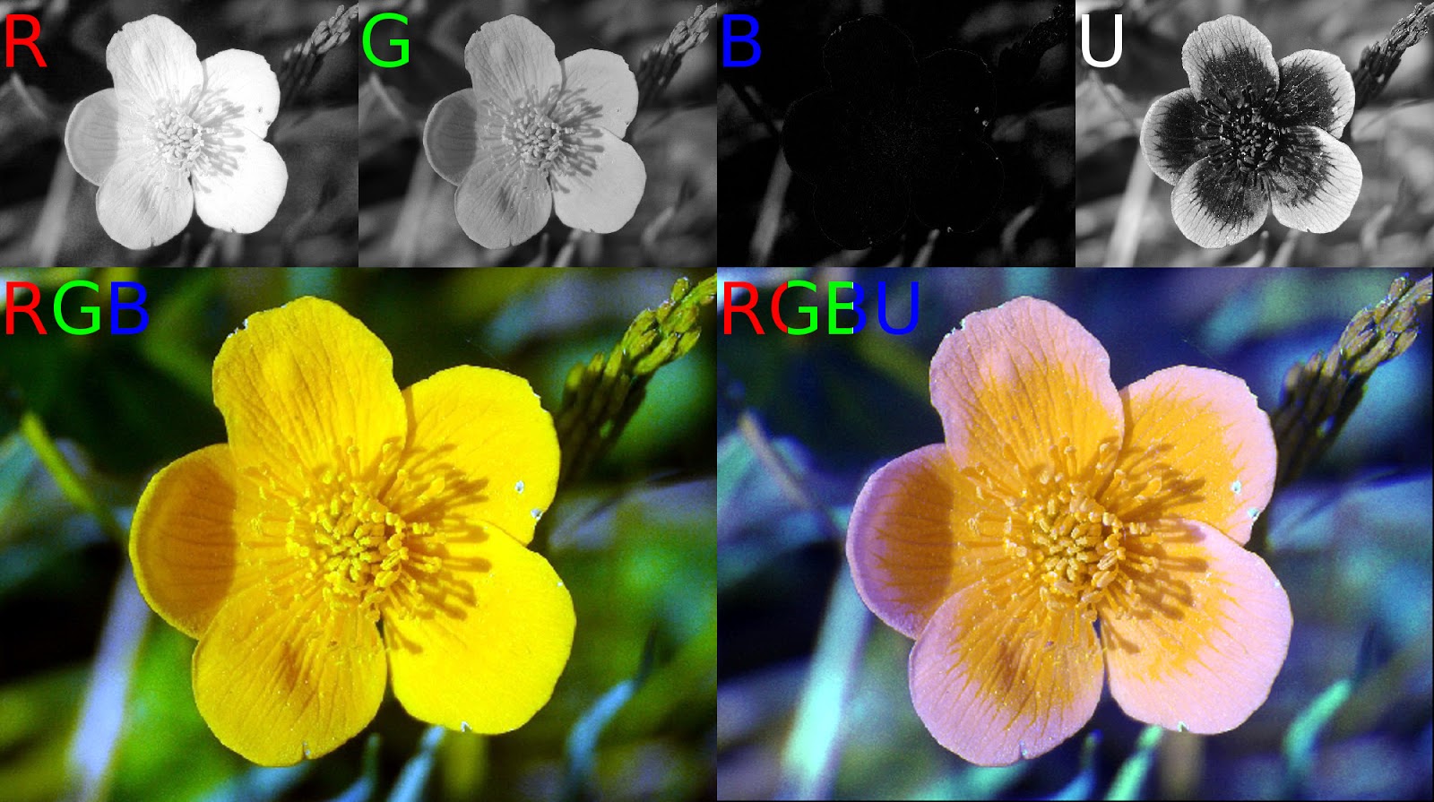 |
| RGBU image channels along top; RGB and compressed RGBU images at bottom. Original photos from [link]. |
In UV this flower of the Marsh Marigold (Caltha palustris) is dramatically marked, but in our composite RGBU image it really doesn't stand out that much. Flowers rarely utilize birds for their pollination, so it shouldn't be any surprise that they might not look too dramatic to birds. (Bees can't see red, but can see UV, so they'd have no problem seeing the marks on this flower.)
Can we find some nice UV imagery of something that birds would care about? Well, it's a bit harder to make paired visual and UV photos of a creature which is suspicious of your intentions. Recently, I came across a post by twitter user @JamieDunning illustrating some dramatic fluorescence on the beak of a Puffin specimen he was examining. It occurred to me that something strongly fluorescent should also be UV-dark, since the UV energy is being absorbed and released at visual frequencies instead of reflected. I realized from this I could construct a simulated UV-channel by inverting the fluorescence image (and mapping the images together to correct for the different camera position (and using a bit of artistry to clean up the fluorescence image)). Performing the same image channel compression as I did earlier, we get the lower-right portion of the next figure.
 |
| RGBU image channels along top; RGB and compressed RGBU images at bottom. Original photos from [link]. |
It would be nice to have a comparable real UV-photo for doing this comparison, but that the simulated bird-vision of the Puffin's beak shows a much greater color contrast than we saw with the Marsh Marigold (and that both results align with the evolutionarily expected results) suggests this might be a useful approach.
My wish-list, money-is-no-option, sort of data for doing this kind of image analysis would be that produced from hyper-spectral imaging. A hyper-spectral camera takes images at a large range of narrow frequency bands. We could map that data (vs. the color sensitivity spectra illustrated in the figure at the top of this post) to what either birds or humans can see, as well as something like the transformation I've described here to illustrate in human vision what a bird could see.
I'm not sure anyone would provide sufficient funding for me to explore this, however.
References:
- Photo sources:
- Marsh Marigold: photographyoftheinvisibleworld.blogspot.com/2016/08/treasury-flower-white-gazania-rigens-in.html
- Puffin: twitter.com/JamieDunning/status/961649481082195968
- Bird vision:
- www.audubon.org/magazine/may-june-2013/what-makes-bird-vision-so-cool
- www.thespruce.com/how-birds-see-color-386467
- www.webexhibits.org/causesofcolor/17B.html
- Bee vision:
- UV photography:
- photographyoftheinvisibleworld.blogspot.com
- photographyoftheinvisibleworld.blogspot.com/2018/02/zufar-4350mm-quartz-fluorite_12.html
- www.lifepixel.com/shop/our-services/ultraviolet-camera-conversion/canon-dslr-uv-camera-conversion
- birdingimagequalitytool.blogspot.ie/2014/08/uv-imaging.html
- Hyperspectral imaging: en.wikipedia.org/wiki/Hyperspectral_imaging